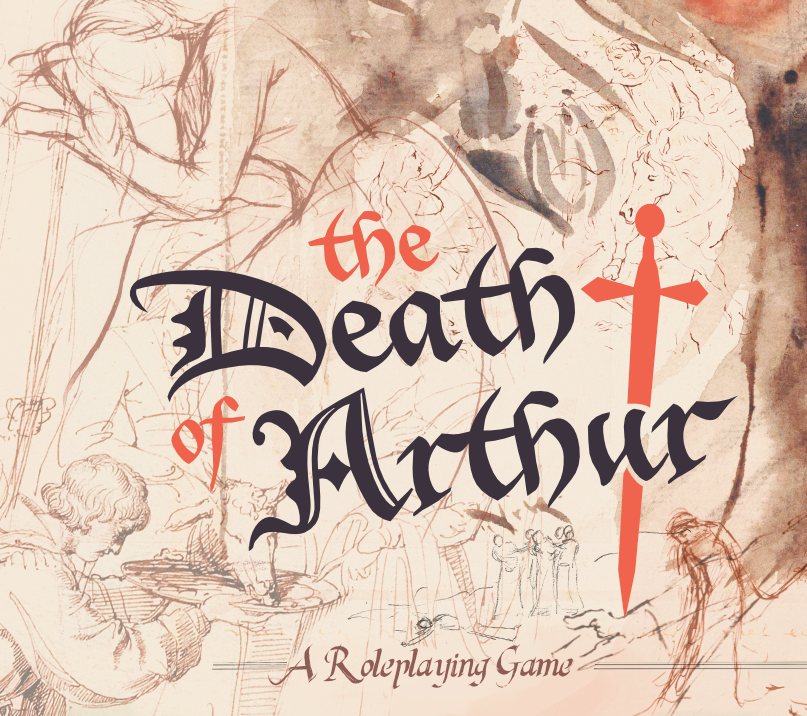
But it’s not the way November is. Art is illusion, storytelling, but in their most sublime form, these images illuminate a path to truth.
Pentiment
On a less relevant topic1, I’ve often sketched out cover designs for this game. Again, this isn’t a publishable game - but I’d like if I do gather all these rules and ideas together, for there to be a bit of beauty in it.
Is this what you should do first when designing a game? No. This isn’t an example to follow.
Is it fun? Yes.
Can this kind of exercise give you insights into the game’s systems or mechanics? Probably not, maybe I can credit it with some insight into understanding what I want from the designs - but even that’s a stretch.
Call to Adventure
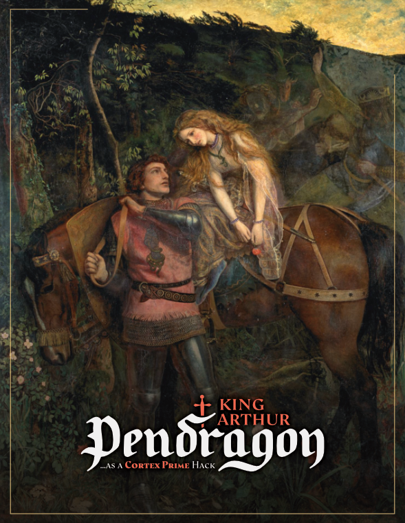
I made all of these covers in anticipation of putting together some kind of rules document for prospective players. The work’s never been publishable, but that doesn’t mean I haven’t wanted it to be beautifully presented; and to just have an excuse to use all the visual artistic inspiration I had gathered.
In this case it’s Pre-Raphaelite2 Arthur Hughes’ 1863 piece La Belle Dame sans merci. I wanted to pick something that represented a kind of timeless knight in what seems like a classic call to an adventure3. Having a lady represented as well, and the sort of phantasmal hints at a broader story behind her, were a bonus4 - and it’s a gorgeously colored piece, though at least in the smaller format of a page the figures feel a little awkward to me5.
I probably will use this somewhere - it’s perhaps my second favorite design still6. And toying with designing it and some pages of rules - even though I had little set in stone yet7
This was also created back when I was designing the Cortex Prime version of the game, as the subtitle suggests - and before I had a name for it.
I did create this own variant of the King Arthur Pendragon logo8. Pendragon has had possibly more logos than it’s had editions - which are all serviceable but very different styles from my design aesthetic. More importantly, I didn’t want players to think this was the official game - just a recognizable derivative.

The final touch to the logo is an homage to the famous sword in the stone9 as a motif that ties the logo together. When I moved to make a distinct title, I’d keep that motif.
Our Other Half
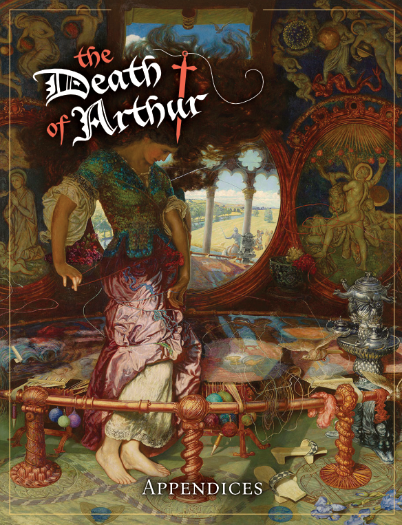
And as I made that new title10, while I wrestled with its placement in the original page11 I also was finding that my planned explanation of rules would be too big to easily put in one pdf12 - so I figured I could distract myself with a companion piece.
Here we have an artwork with its own Wikipedia page13 - William Holman Hunt’s The Lady of Shalott after Tennyson’s poem. Once again, a Pre-Raphaelite piece - again, beautifully colored - and with a dynamic intricate composition14.
In particular, having the doomed lady, doing exciting and meaningful non-knightly things, as its central hero - with Lancelot only distant in the window15 - provides a bit of a counterbalance.
Similarly, the sword in this variant (meant for just this cover) takes on a dual role as a needle.
The Unfinished Work
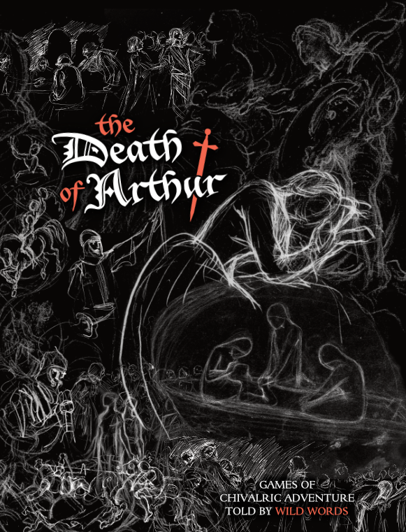
I took a very different approach in the next redesign.
In a point that works as a larger metaphor, when you keep digging into an artist or school of artists, you eventually start finding and appreciating a lot of their rougher sketches.
Their unfinished nature also makes them easy to compose - there’s only certain key details, usually a limited background, which can be filled in with the imagination and other sketches in ways that only a very skilled artist could composite the real works.
So this cover uses a variety of sketches - primarily from Dante Gabriel Rossetti, Edward Burne Jones, Edwin Austin Abbey, Lorenz Frølich, Sir John Everett Millais and Pierre Henri Revoil to represent that sense of filling in the details with the players’ own characters.
Most (though there’s a few exceptions) of the sketches I found were some kind of dark line on various light shades, but black on white made the differences in pencil stroke and scan contrast much more obvious than the inverse - which I also thought gave it the darker feel fitting the title.
Unfortunately, the result was maybe a bit too edgy looking - almost a gritty or punk aesthetic, or at least something that an OSR style rpg looking for that vibe would aim for. Like the cover of The Black Hackmixed with a bit of the rougher textures of something emulating the style of MÖRK BORG16 - or even a Trophy Dark adventure.
Gloom and Doom
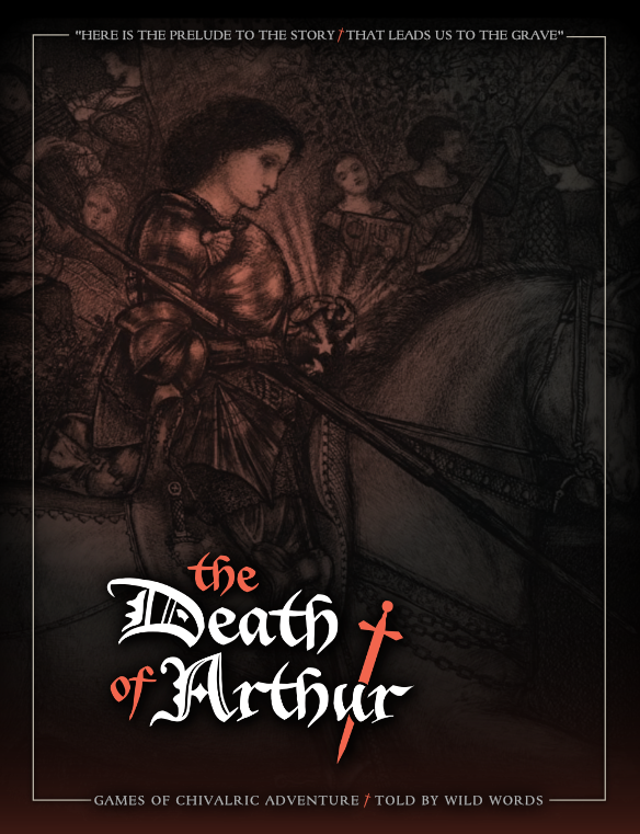
Still wanting to sit in the melancholy of the title, but in a more staid, uptight way17, the next cover turns to a much more traditional framing and finally gave me a composition that could put the title flat.
Edward Burne Jones18 brings us this cover’s Sir Galahad and the distant, detached celebrants behind him - an attempt to still give a wide view of the kinds of characters in the story19.
And to quote a piece of Arthurian poetry as a subtitle20, I picked a piece that had stuck with me from John Masefield’s The Fight on the Wall - which ends with21:
Here is the prelude to the story
That leads us to the grave.
So be it: we have had a glory
Not many have.
Though what tomorrow may discover
Be harsh to what has been,
No matter, I am still your lover
And you my queen
The Knight
By this point it may surprise you to hear that the next artist I’ll reference is not a Pre-Raphaelite! Despite what it may seem, I do have other artistic references, and don’t want the game to be just the Victorian view of the Arthurian, no matter how influential that is.
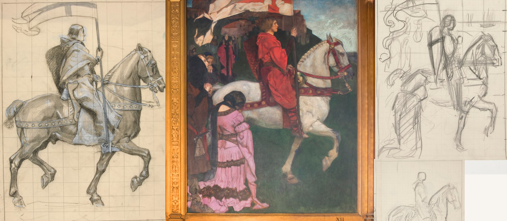
And the Dutch modernist painter Willem van Konijnenburg has a striking vision of a Knight on Horseback that caught my eye when I was looking through museum collections - in particular because it shared a rough red highlight, much like a lot of the other design work I had.
The composition was again tricky -
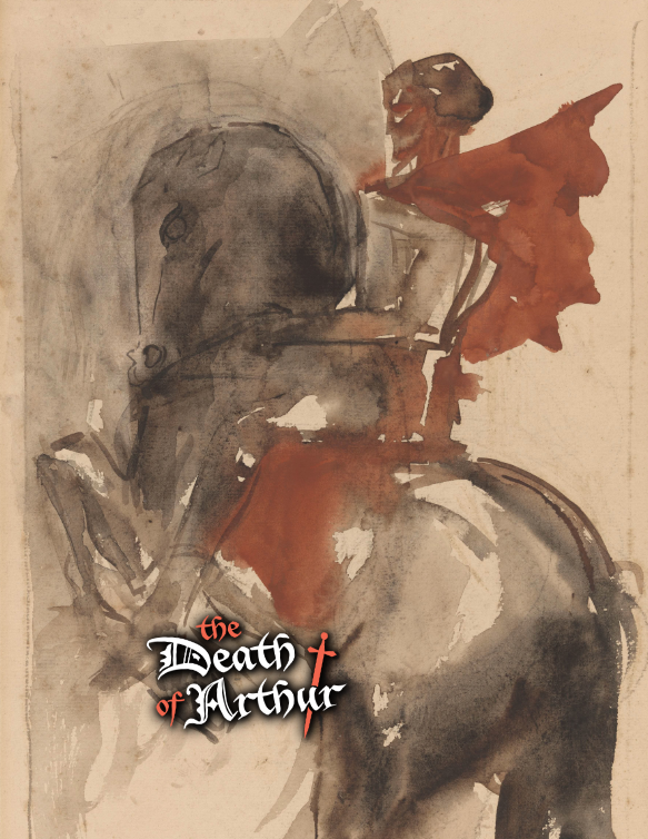
- horses really are hard to fit around a title in portrait.
But after getting the above rough idea, I felt I was satisfied that it could be done - going back to the composition of sketches idea with a bit more experience this time:
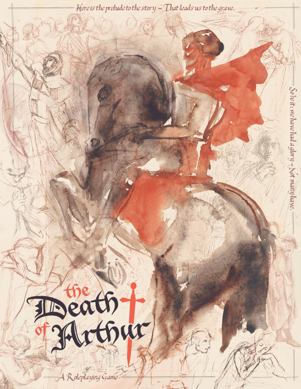
We have a clear central knightly character - but open to interpretation in its vague shapes - surrounded by the spectral possibilities of adventure all around, like in the first cover. The sketches let us see a lot of dynamic emotions and open scenes, including a variety of different character types - and we have it framed22 again with the Masefield poem’s lines (here in the looser, Last King Quest by imagex fonts) reminding us of the final picture.
Bonus - A Wolf Age
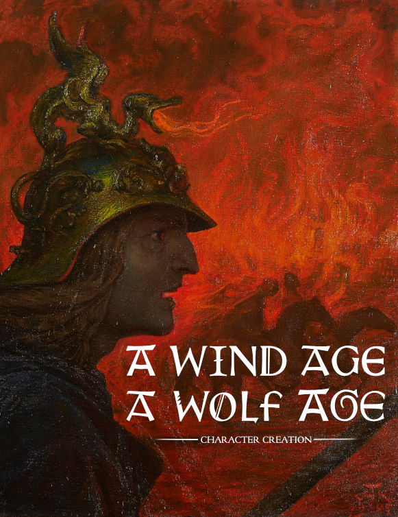
The first title page to actually be used by players was none of the above, though. As I actually prepared to play A Wind Age, A Wolf Age, I needed to package some rules text - and The Death of Arthur wasn’t going to make a lot of sense to that context - it needed a new title and a new visual identity.
With the interests of exciting player interest, the title is from the Völuspá’s account of Ragnarök:
Brothers will fight
and slaughter each other,
sister’s-sons
will their kinship violate-
ill are the days among men
in this time of wickedness,
an axe-age, a sword-age,
shields will be shattered,
a wind-age, a wolf-age
at the world’s ending
and I wanted something that leaned into that sense of uncertainty and violence of the age23 - which I found in Hans Thoma’s Der Krieg24.
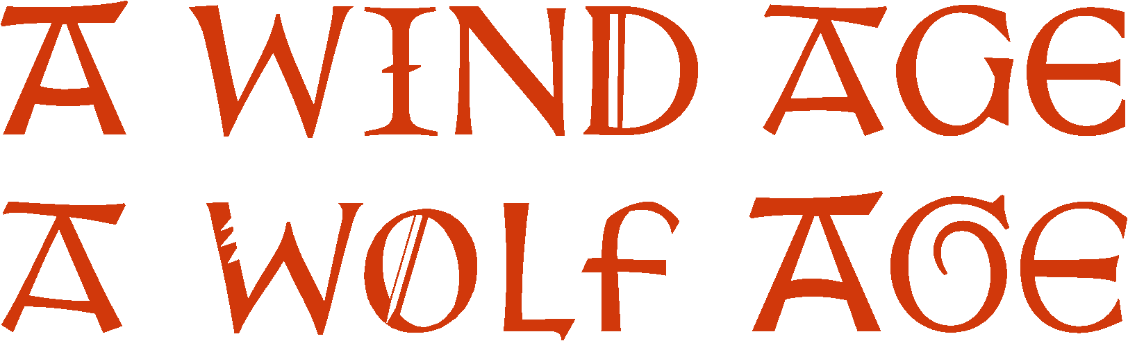
The title comes from a mixing and matching from the collection of fonts of the Atelier National de Recherche Typographique’s Gotico-Antiqua project, with a few custom twists like the wolf’s “claw-mark”. I wanted something that felt rough and pieced together, and where the repetitive letters in the logo25 wouldn’t stick out as much.
I think it is the better logo of the two, personally, especially with how it effortlessly fits into the composition of the cover.
Footnotes
-
It is what you might call “filler”. ↩
-
The Pre-Raphaelite Brotherhood was a mid-19th-century British art movement with a heavily Romantic style and a love of medieval culture and aesthetic (literally pre-Raphael as in the ninja turtle/Italian Renaissance painter). While the original group didn’t include Hughes and broke up relatively quickly, its style would continue to be very influential - especially in the Arthurian crazes after the publishing of The Idylls of the King. It’s perhaps the iconic style for the romanticized version of Arthurian myth. ↩
-
Of course, in this case from the poem we find that this damsel is in fact not drawing the knight to some virtuous quest, but instead is ensnaring him. ↩
-
Though… the villainous aspect of the lady in its actual context is unfortunate in terms of my context of it. ↩
-
I have no place to stand on any critique here, to be clear. I just think despite the wonderful color work from Arthur Hughes, there’s perhaps a reason why the theme is much more famously covered by fellow Pre-Raphaelites Frank Dicksee or John William Waterhouse. Or, I guess another part of my doubts on this one is just that it’s a bit too Pre-Raphaelite. ↩
-
It should be clear that while I didn’t need to make any of these covers, I’ve never needed to make the remakes either. This started out perfectly functional. ↩
-
And what I thought I had settled all turned out to be vaporous anyway. There’s plenty of good reasons to try to avoid working on such final-polish details as this until after you’ve gotten the rough design working. ↩
-
Using a font I had been using extensively for the sheets themselves - Árida by Latinotype, and Ana’s fonts’ Candlebright for the main text - which you’ll also see across sheets from this time period (and beyond - still a great, versatile font). ↩
-
-and anvil, technically. ↩
-
With Xenippa by Dr Marianne Steinbauer - a more frenetic, dynamic take on blackletter than the previous - which later would also find use in the character sheets. ↩
-
I could show that too, but it’s literally just the same as the above cover but with the name changed. ↩
-
Partially because of an unclear organization - which is one thing I hope my iterations of rule explaining here will help with - partially because I do use a lot of art and the actual file size gets big (as I’m not the most competent layout art optimizer). ↩
-
Perhaps too iconic to give a distinct picture to the game. ↩
-
Again, maybe a bit of a shame to compress into a title page with its own desires for composition and focus. I love the artwork, surely will use it somewhere - but might not use it as a cover if I don’t have a need. ↩
-
Even if arguably he’s the key agent of the narrative. ↩
-
No offense intended to either game, which are great, and aesthetically fitting. The point is those styles (and the way they accentuate the title) are definitely suggesting a very different kind of game than I’m aiming for. ↩
-
Because the game… is more uptight. A lot of the inspirations are more of an elegy - even sometimes a saccharine, prim Victorian one - than a riotous kind of death. ↩
-
Yes, another Pre-Raphealite. How did you guess? ↩
-
Though I felt it ended up cutting out too much of that. ↩
-
Because, as you can tell, I love quotes. ↩
-
I originally remembered this as the more concise “Here begins the story, that leads us to the grave” - the actual form is a little harder to fit in. ↩
-
Including an asymmetrical bit on the right that I’m not sure about, but the balance of the overall page is not quite centered. ↩
-
Something which is present in the Arthurian timeline, but especially in the first periods before Arthur - which was what I was focusing this campaign to be a slice of. It wouldn’t be that fitting for the periods of high chivalry and romance. ↩
-
And it’s fairly abstract in its time and place, with a Wagnerian style that fit the Nibelungian references I was pulling in (though also the helm reminded me of Turin Turambar which in the loose medievalism I’m spinning around also fits into the feeling of the era). ↩
-
I didn’t quite succeed at disguising the repetition of the A’s, though you’ll notice they’re slightly tweaked. The A with the bar on top just really caught my attention, and it was a rarer style among all the types. ↩
